
I have created a book!
My Photoshop tutorial book Digital Manga is currently available in the Shop.
It primarily covers Photoshop CS6 and CC, although most if it can be applied to earlier versions such as CS5 and CS4. I'd imagine a large chink of it could technically be applied and translated to other software such as Paint Tool Sai or Clip Studio Paint.
It details every little trick I've learned and implemented over the last dozen years of producing digital artwork by demonstrating a practical use on character art.
It's something I'm proud of and hope it can be as useful to aspiring digital artists and my other how-to-draw books have been for manga enthusiasts.
"Why Photoshop? It's such expensive software compared to alternatives"
Beginners might opt for cheaper software as their digital tool to start, and I wouldn't blame them. Something like Sai is great! I like it for inking and I've seen incredible results achieved with it.
Although alternative software tends to have limits, and it's hard to argue a case against Photoshop's power and versatility.
It's a tool students will eventually need to get to grips with once they go to Uni and Adobe programs are set up on their university or college computers. Then after graduating, you'll find most in-house film, animation and game studios are still favouring PS for 2D art creation.
If you want to be a professional and aren't taking advantage of PS's blending modes, Plug-ins and brushes, you could be doing your artwork a disservice or making things harder on yourself in the long run.
Also, once you get to grips with PS, learning other software in the Adobe family becomes a little easier. Illustrator, InDesign or even Dreamweaver share a similar interface and are designed to be cross-compatible. Learning PS for my manga art later allowed me to get employed as a full time web and graphic designer for several years. Other art or comic design software wont easily allow that kind of transition.
Why should I buy your book and not a different digital art guide or just find online tutorials?
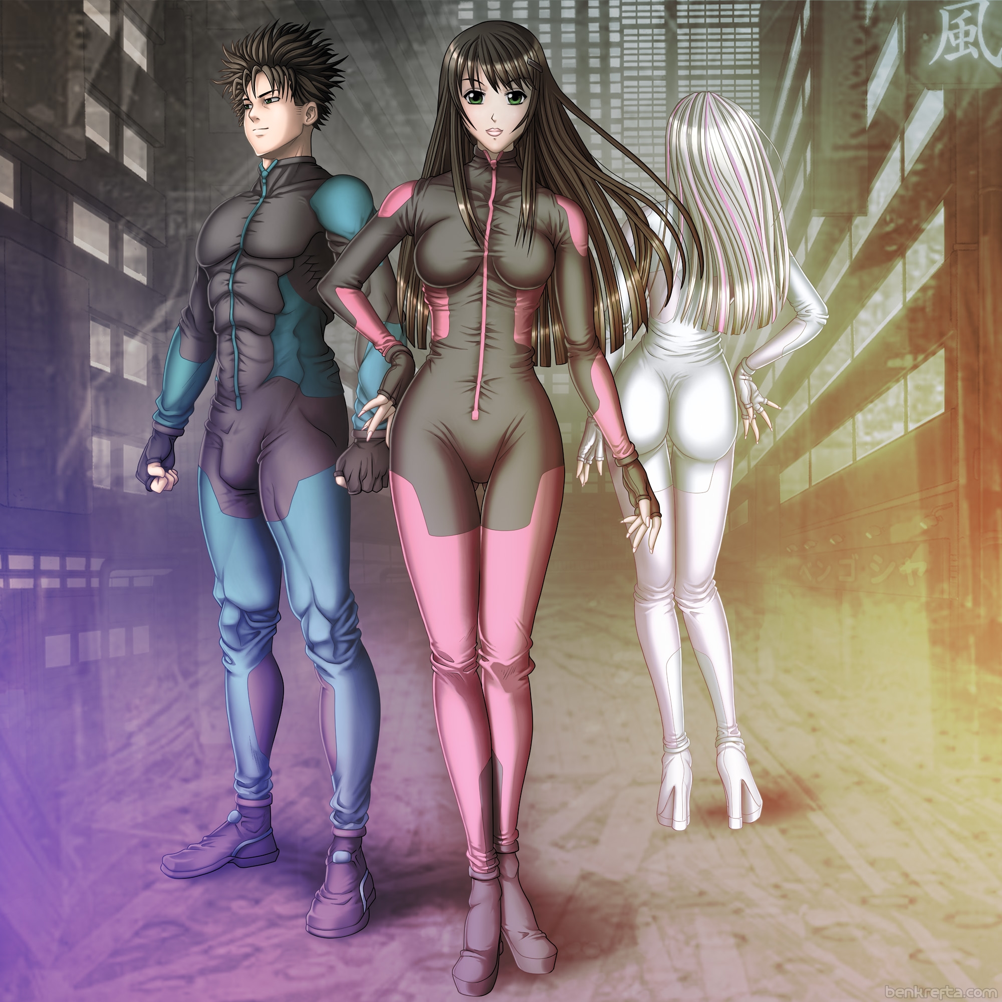
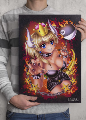
1. I have a lot of faith in my book, Photoshop skills and breadth of knowledge. I'm experienced and confident with what I'm talking about. I've been using Photoshop since Version 4 back in the late 90s and experienced close to a dozen versions of the software. Don't take my word for it- check out my portfolio. The colour work is smooth, clean, detailed and expertly rendered. I'm teaching readers how to achieve a similar deep, vibrant and professional look to their artwork.
2. The book covers the latest version of Photoshop- books published several years ago may cover out of date software. I've tried to make Digital Manga backwards and forwards (as much as is possible) compatible.
3. Digital Manga's tutorials covers a lot, and in-depth. The aim is to bring a novice up to a similar level to myself as quickly as possible. Art still takes a ton of time and practice to get better, but if I can bring a reader's colouring and rendering skills up a notch or two for a reasonable price, I'd like to think that's worth it.
4. Online tutorials can be a bit hit and miss. Before writing Digital Manga, I spent a long time researching what's already online. While there is some excellent stuff out there, it can be hard to find everything a beginner might need. There's also a lot of confusing, poorly written instruction to contend with. Where as I'm able to draw upon my years of teaching experience from tthe previous how-to book's I've had published in order to deliver detailed, yet concise information.
5. Online tutorials are scattered across the web in various locations while Digital Manga houses 160 pages of info in one place. - That info has consistency. It's written by the same author, so you know you wont be getting confused by trying to follow different terminology or a different way of doing things from a variety of different teachers. With digital art, there are multiple ways to achieve the same result so I'd say be consistent and get the basics down before exploring other methods.
6. Even if you read a lot of tutorials and have other art books, there's always room for another. One should never stop learning. And I'd be very surprised if a reader didn't learn at least one new, useful technique from the book.
7. Line art and assets contained in the book can be downloaded for readers to practice on and follow the rendering tutorials Step-by-Step.
8. I want you to become better! I'm happy to offer assistance with any aspect covered in the book, so feel free to email me if you're having difficulty with something and I'll do my best to assist.
And if you've read it, let me know what you think in the comments below.


 RSS – Posts