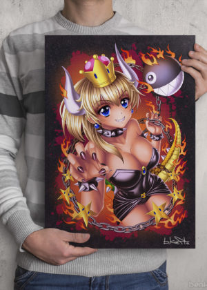
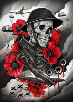
Some Creepy Monster Designs:
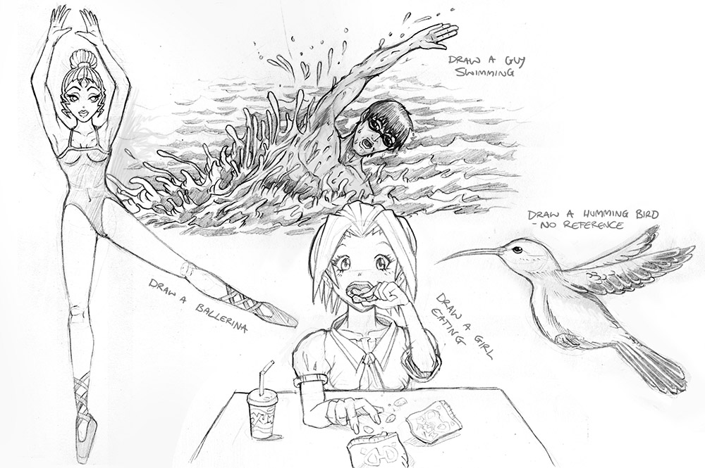
Some Random Sketch Requests:
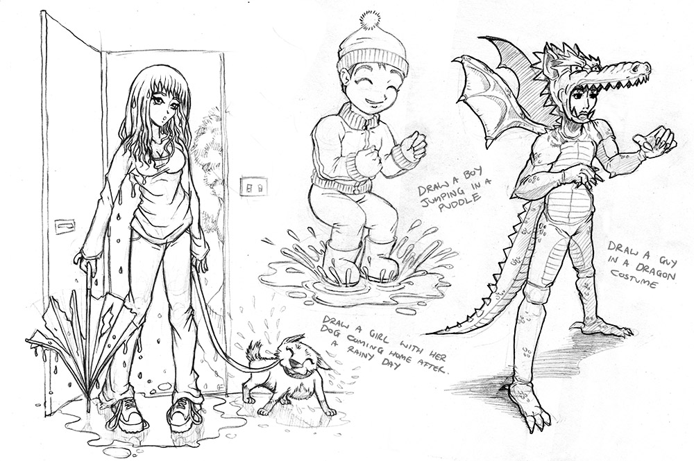
Some more Random Sketch Requests:
Some Creepy Monster Designs:
Some Random Sketch Requests:
Some more Random Sketch Requests:
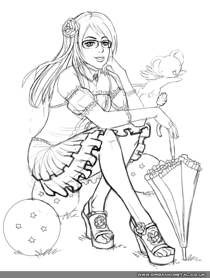
This was made as a gift for a Dad's daughter, Tegan. She's a fan of Japan, Dragon Ball Z and Card Captor Sakura, so it was cool to get a few references in there with her portrait.
I think this must be one of the few times I draw a seated pose, and I like the colours with this one. Looking back, my only regret is that the shoes should be closed-toe, but like with every picture, you do what you think is right at the time.
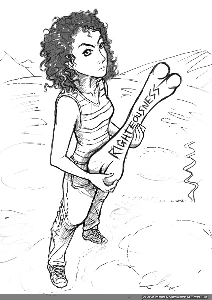
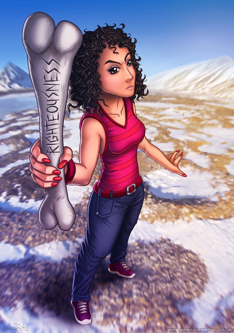
This commission was drawn for a friend of Jessica. She needed to look like she meant business and went with a foreshortened perspective with this. I don't know what the dinosaur bone is about? I'm sure it has some significance.
I'm not a caricaturist by trade so adapting the art I do to look like someone specific but with a manga vibe is always a challenge. Is it possible to convert real people's features into a simplified and stylized manga form (such as Pokemon, Dragonball) while managing to retain a likeness?
This anime style portrait illustration was created for a a young family's twin daughter's Birthday. Made with the intention of being printed on a birthday cake. I wonder how it looked in the end? Or how it tasted?
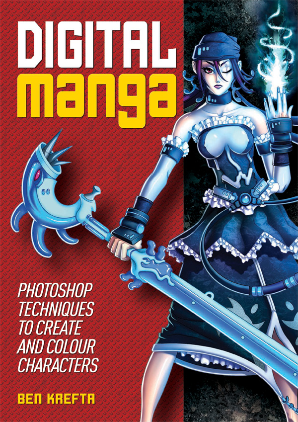
Here's a a short overview how I created Digital Manga- A step-by-step guide, teaching more or less everything I know about Photoshop and turning an initial drawing into a full rendered work of art. Perhaps you'll find it useful, or interesting to learn what was involved?
People have often been impressed with my digital colouring. And so I've wanted to create a book on how I colour my character art since my last year at Uni, back in 2007. Finally in 2013 I put together a proposal and asked the Publisher of my previous titles if they'd be interested in the project. It got the go ahead!
Originally, I wanted full control of the project, even down to creating the layouts. Although I was asked to alter my initial idea somewhat to make it work for the publishers. But I was so keen to see it out there that I was happy to compromise. We dropped a section or two and added in something else and I needed to collaborate with an in-house graphic designer who took the lead on layouts.
In 2014 the book was finished and Published. I was happy!
It took a while to complete- the initial given deadline was around 4 months to submit both the text and images. I then needed a number of weeks some time later to revise the page layouts and re-check over the edited text.
Initial planning took a few weeks prior. I had already created a 30 page BLAD (book layout and design proposal) years ago, which helped speed the initial planning stages up, and of course aided in pitching the idea to the publisher.
Fortunately, I also already had several finished character artworks I'd go on to contribute to the book. Each of which would have otherwise taken a good 20 hours to complete.
I worked my own hours. Some days spending 15 hours solidly working. Other days, just 4 or 5 hours. With 160 pages to fill up with well written, fresh content, it was never going to be a breeze. If I were to guess, all in, I must have spent well over 500 hours on the project.
I wanted the book to be one of the best things I'd ever produced! I was willing to go above and beyond to bring it up to my standards, even if the publisher was otherwise content with a product that was passable. Unlike my previous book TAODM, Digital Manga needed about 55% more written content and 50% more image content. Unlike the previous book, I also didn't want to use a writing assistant or several image contributions from collaborators this time around. It was important that the work would be my own. Other than a a couple of pages at the back offering tips from fellow artists I happen to follow.
I also took it upon myself to record / screen capture several of the book's character tutorials. These were converted into time lapse videos and upload to a web page I'd created along with downloadable content.
The book had been available for years now. I appreciate it may not be everyone's cup of tea, or it may not be the best instructional book in the world, but I'm really proud of the end result. After having researched hundreds of online art tutorials, forums and videos over the last decade , I know the book is covering all the necessary bases and more. It draws upon everything I've learned about Photoshop art creation since I started using it back in 2000. Years later, the book's content is still relevant even with modern versions of Photoshop having been released.
Like with many books sold, I realise a lot of readers will simply just buy it for the pretty pictures and with the intention of one day making use of it. But I really hope people out there get the chance to read it fully or practice some of the content I've provided. I'd love to know readers have learned something interesting, useful, and for the book to help with their digital art endeavours.
The book isn't as perfect as I'd like it to be. Frustratingly, I found several small errors still left in the book after having gone to print! (Mostly not my fault). These could have been easily resolved, but unfortunately, I was not given the opportunity to check out a final proof. I imagine the publishing team were up against deadlines or problems of their own and not as invested in the project? I did all that I could to make sure many of these errors were rectified when to book was reprinted in my expanded Art Class: Manga Art title.
I remember having to spend a lot of time adjusting the graphic designer's layouts or advising upon how each page was presented. There were an unacceptable amount of inconsistencies and some cases, horrendous design choices- use of garish, clashing colours, tacky background images. I hate to think how the book would have ended up had I not insisted on overseeing the layout stages. It was frustrating that the publisher insisted on using their own graphic designer for layout when I knew I could have done a much better job.
I suspected sales wouldn't reach the same levels as my previous titles. While the book is, in my opinion, totally awesome and a huge step up from the last ones, I realize Photoshop isn't as accessible to manga fans as a pencil and paper. Or indeed cheaper and free art software which many beginners use. While the book is accessible, some of the content is more advances and not something for complete novices. The book teaches how I work, but this may not be to everyone's taste.
Communication was done completely over email. It was great to have a record of everything sent and received and suited my late working hours.
Although there is this detachment whereby I don't know exactly what is going on their end. Like me, are they also frantically trying to get everything done and staying up until the early hours to do so? Or are they not taking the project as seriously, slapping together a half-baked job and calling it a day? If often felt like the latter. It can be easy to fear the worst if there is a lack of face to face communication or if there's a problem and I can't talk to the designer, the sales team, the accountants directly. Instead everything is going through the editor as a middle-man.
Another tutorial book perhaps? I was asked to work on something else which has the same of visual impact as Digital Manga. At the time of writing, nothing has been confirmed yet. I've already given my all to this book. It's hard to know how I can top it. For now I'll continue to build up a new portfolio and give myself a back-catalogue of fresh, full coloured artwork to use in a new title.
Until then, I'm looking forward to producing some more artwork and moving onto the next stage of my career 🙂
A C+P from chrisoatley.com. Thought it was worth a repost on the blog...
What Do Bad Clients Look Like?
Many years ago, I was offered what sounded like a nice freelance gig.
An oil painting. A huge portrait of a couple that would be given to them as a gift.
The painting would have taken me about two weeks.
I quoted my hourly rate which was around $35/hr at the time.
2 weeks (80 hours) x $35/hr = $2800
If you ask me, for a huge double-portrait in fracking oil paint, 28-hundy is a legitimate steal.
But the man offering the job did not agree. In fact, he was shocked and offended. He had a much lower figure in mind…
He the offered me $25 for the portrait.
I asked him how much he got paid for his job and if it was higher than $12.50 a week.
…and that’s the end of that story.
Granted, the “$25 Portrait” example, although true, is ridiculous. No sane artist would accept that guy’s offer.
My point here is that bad clients usually look bad right from the beginning.
It’s desperation that blinds us.
It is our desperation that gives power to the bad clients.
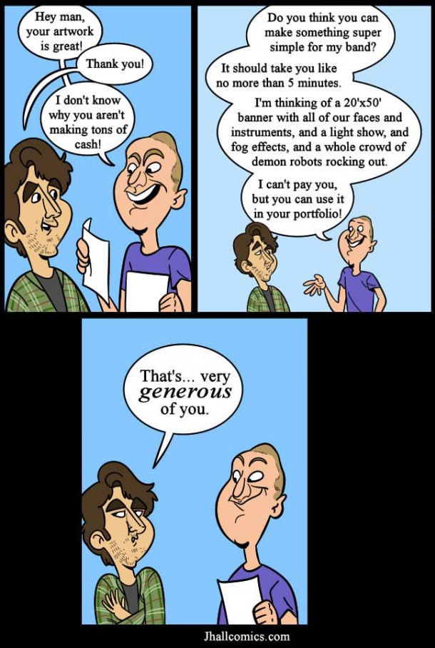
I'd say this example represents 90+% of the job offers I've had while freelancing. Perhaps not to this extent, but similar. With the huge pool of internet artists for both companies and private individuals to choose from these days, generating the kinda money an artist deserves is no easy task.
I drew the cyberpunk ninja Bengosha a long time ago. He was originally created for a character design contest and then used as a character example in the book 'The Art of Drawing Manga'. This year I started working on a new book about digital techniques due for release in 2014 and decided to include a Bengosha revamp.
I still like a few aspects of the original, even if it is a very old piece, although I hope anyone else agrees that the new art is an improvement! I've never been an amazing artist and probably never will, but I still like to think I'm pretty good at busting out a cool picture here and there when I put in a lot of time and effort 🙂
I've worked as a manga inspired/influenced/style artist for years. Although a large percentage of people I meet don't really know what manga is! Let alone understanding the differences between it an anime. Older relatives, or those completely removed from popular culture often need educating. For most people who are unfamiliar, I'll usually just say I draw "Japanese style comics and cartoons". However, I don't think the answer to "What is manga?" or "What is anime?" is a simple 'one description fits all scenarios' sentence. With a little help from Wikipedia I thought I'd try my best at summing it up these definitions.
Anime is a term to describe animation created in Japan. In the west, the term is “anime” is defined as a style and genre of animation typically originating in Japan, and can often feature detailed, colourful imagery, unique, in-depth characters and action orientated plot lines either set in the past, present, future or often within a fantasy setting. The meaning of the term ‘anime’ can sometimes vary depending on the context it’s used in.
Manga is a term to describe comics created in Japan, or produced by Japanese Manga Ka (artists), primarily for a Japanese audience. The style was developed in Japan though the mid to late 19th century with heavy influences from western and American comics combined with the long and complex history of Japanese art and wood-block prints. In the western world, the term is often defined as a style of drawing originating in Japan and many western artists have adopted this style and refer to themselves as Manga artists.
We could summarize, that typically:
Anime = animation in a typical Japanese cartoon style. Often in full Colour.
Manga = comics in a typical Japanese cartoon style. Often in black & white and with grey tones.
How would you describe anime and manga to the uninformed?
I decided to join up to Amazon Affiliates today. If you want to purchase my books, or indeed any other book through Amazon, be sure to do it via clicking on these referral links below. Many thanks for your support 🙂
I just want to give a quick overview / review of my work area. Nothing too in-depth, but hope it's useful to get a gist of another digital artist's set up.
Here's my 2014 set up: Upgraded Lenovo Y500 Notebook PC running Photoshop CS6 + a Wacom Cintiq 22HD mounted onto Dual Ergotron LX Arms
I've now used it to create three or four recent artworks over the last few months. It's working out well. I use the adjustable Ergotron Arm to have it in a floating, elevated position for day to day use and bring it down to the desk at around a 45 degree angle for art projects (see above). I decided to program the Cintiq buttons from top to bottom (for Photoshop use) as:
These would work great for me. The trouble is I often forget to use the the Cintiq's buttons as I'm so used to keyboard keys. And while, in theory, simply having to shift my right thumb to press the buttons would potentially simplify and speed up work flow, most projects still require me to use several other useful short cut keys so often neglecting the buttons and instead sticking exclusively to the keyboard seems to make sense right now.
The screen size is good. I didn't feel I needed the extra couple of inches from the 24" version, and the lower weight from the 22 incher means the adjustable arm I use doesn't have a problem keeping it suspended off the desk. It's not cutting edge screen tech, but gives a good quality result far greater than my previous monitor set up and I have no complaints. Also glad I didn't pay the extra for the touch version as I doubt I'd make use of those features.
At the moment the pen uses a standard nib, which I'll probably change to a felt nib as I like the added friction and softer tip feel. I'm still wondering if I need to get a 'Smudge-guard' glove to reduce palm friction. So far I've not really found this to be a problem so I'll stick without and see how I get on using it over the coming year.
My keyboard [Microsoft Wireless 6000 v3.0] sits to my left (since I'm right handed) and it's pretty comfortable to use while I rest my palm on the desk/palm rest and my elbow on my chair's arm.
I've since extended the Ergotron laptop arm so the screens don't butt up against each other or need to overlap and there's enough space under the tech to clean and dust. All cabling is concealed within the arms themselves.
My printer [Epson 1500W Stylus Photo A3+] fits nicely at the back in the corner typically covered with a custom made cover to keep dust at bay.
My mouse [Microsoft Wireless Mobile 6000] sits on a gel filled mat, which saves me from RSI.
The Cintiq is connected to the laptop via a DVI to HDMI cable. This required opening up the back of the tablet to attach (twice, since I've since extended to cable length from 2m to 3m).
I also bought a Intuos Pen for when I take my laptop elsewhere and obviously the Cintiq has to stay at home. I've used it the Intuos once so far and liking it. I'd better start coming up with some new artworks so I can put this new tech to use.