• HOME
  • SHOP
    • SHOP ITEMS
    • CART
    • CHECKOUT
  • PORTFOLIO
    • GALLERY
    • SLIDE SHOW
    • PROJECTS
  • BLOG
  • TOTAL BLAST
  • ABOUT
    • PROFILE
    • BACKSTORY
    • WORKFLOW
    • NEWS LETTER
  • HIRE ME
  • CONTACT
Art, designs, illustrations, text and content © 2025 BenKrefta.Com

Unicorns – Glow in the Dark Colouring Book

by Ben July 21, 2021 in Art, Art Talk, Thoughts 0 comments tags: coloring book, unicorns

Unicorn Manga Blog Pic


Unicorns Coloring Book CoverMy latest book is published!

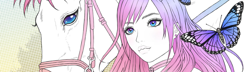
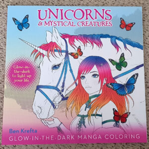
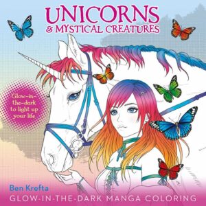
A new project has been added to my Portfolio - A manga style Unicorns Colouring book featuring a selection of pages which glow in the dark! I'd considered the idea of creating a colouring book for at least a decade. In 2020 I finally got the opportunity to create one. Red Bird Book publishers asked me to work on a special Glow-in-the-dark book for their client Thunder Bay Press in the USA. 'Unicorns and Mystical Creatures' has been available to buy for nearly a year now.

It's sold tens of thousands of copies and has received a fair amount of praise and positive reviews since. While I've certainly drawn enough unicorns to last me a life time, I wouldn't say no to working on another colouring book whereby I get to pick the theme. Monsters perhaps? 🙂


When is the next colouring book coming?

Customers who'd bought the Unicorns book often ask when my next colouring book is coming out. The short answer - there isn't another book in the works as of right now. I've had a few publishers ask if I'd work on a number of other colouring books since finishing Unicorns. We got so far as producing sample covers and a few pages of content for books on the theme of: Tattoos, Dream Catchers, Kaleidoscope patterns and Horror. Although due to budget constraints we couldn't quite make it work.

I'd be happy to work on another, but because of the amount of artwork needed to produce a good quality 96 page colouring book, I'd need to make sure there was sufficient funds to make it viable. It's tough- the market is saturated with colouring book options. I even noticed one on Amazon the other day which used one of my artworks for the cover - illegally and without permission!

Although with so many sub-par books to choose from, it seems like a good idea to create a series of premium books. Books which have a lot of nice, high-quality drawings to colour on good quality paper. Perhaps also including how-to guides and advice showing how to use more advanced shading techniques? If you're a book publisher that wants to make this happen, let me know.

In the mean time I look forward to seeing what artists and colourists alike can do with the Unicorns book 🙂


Here's a few coloured samples from the book:

[caption id="attachment_5031" align="aligncenter" width="940"]unicorn coloring 01 
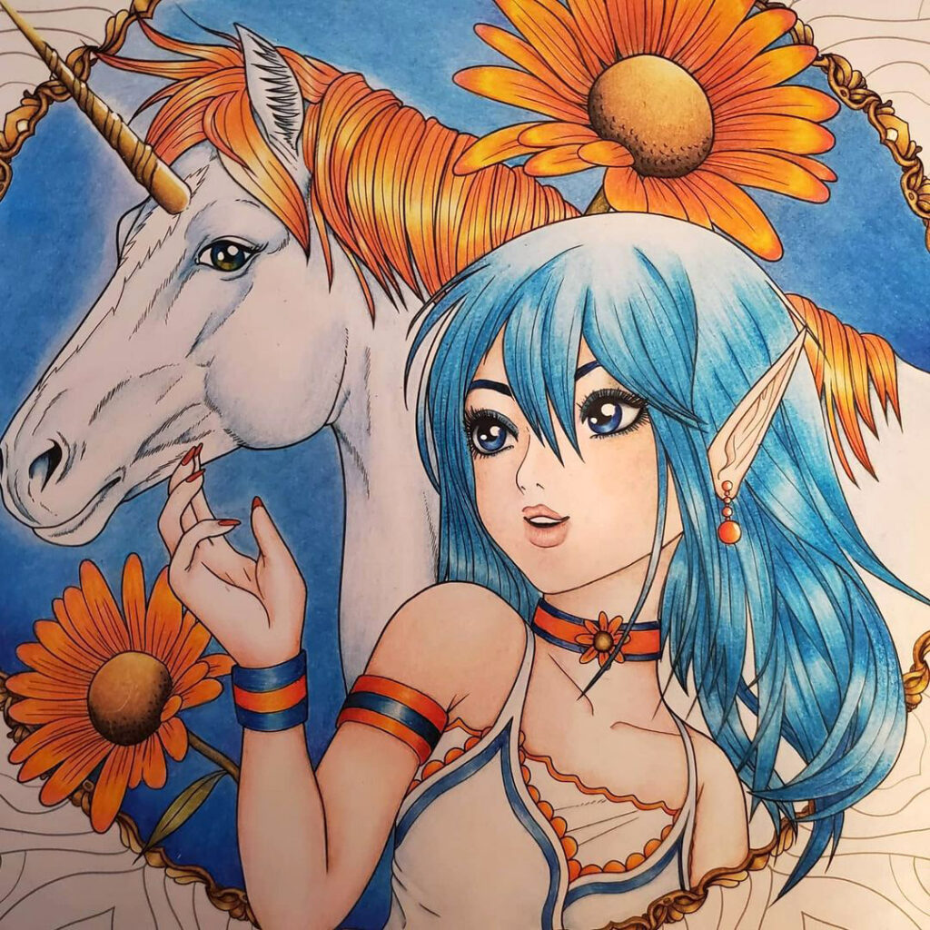
Colours by @colorfulcarey on Instagram[/caption]


[caption id="attachment_5032" align="aligncenter" width="842"]unicorn coloring 02 Colours by @bizzie_lizzie.art on Instagram[/caption]


[caption id="attachment_5030" align="aligncenter" width="930"]Unicorn and Man Art Art and Colours by myself - Little tester with some new marker pens.[/caption]


Other designs:

I printed out a couple more of the illustrations I'm created from the book. A Mermaid and Harpy. These were added to A3 Bristol board so I could give them the marker pen treatment. I used a inexpensive set of bullet-point markers to colour these. While I prefer using brush markers, these can certainly do the job.

[gallery size="medium" type="rectangular" ids="4609,4608,4606"]

[gallery size="medium" type="rectangular" ids="4615,4613,4612"]


Horror Book:

As mentioned earlier, I didn't end up working on a sequel, although here's some work-in-progress images for the Horror colouring book which didn't quite happen. I hope you find these interesting. I like the first Haunted Horror sketch, although it was deemed too sexual even though it's for an adult colouring book. I guess the client felt ghouls looked as though they were preying on the girl?

[caption id="attachment_5037" align="aligncenter" width="900"]Horror Cover sketch 1 
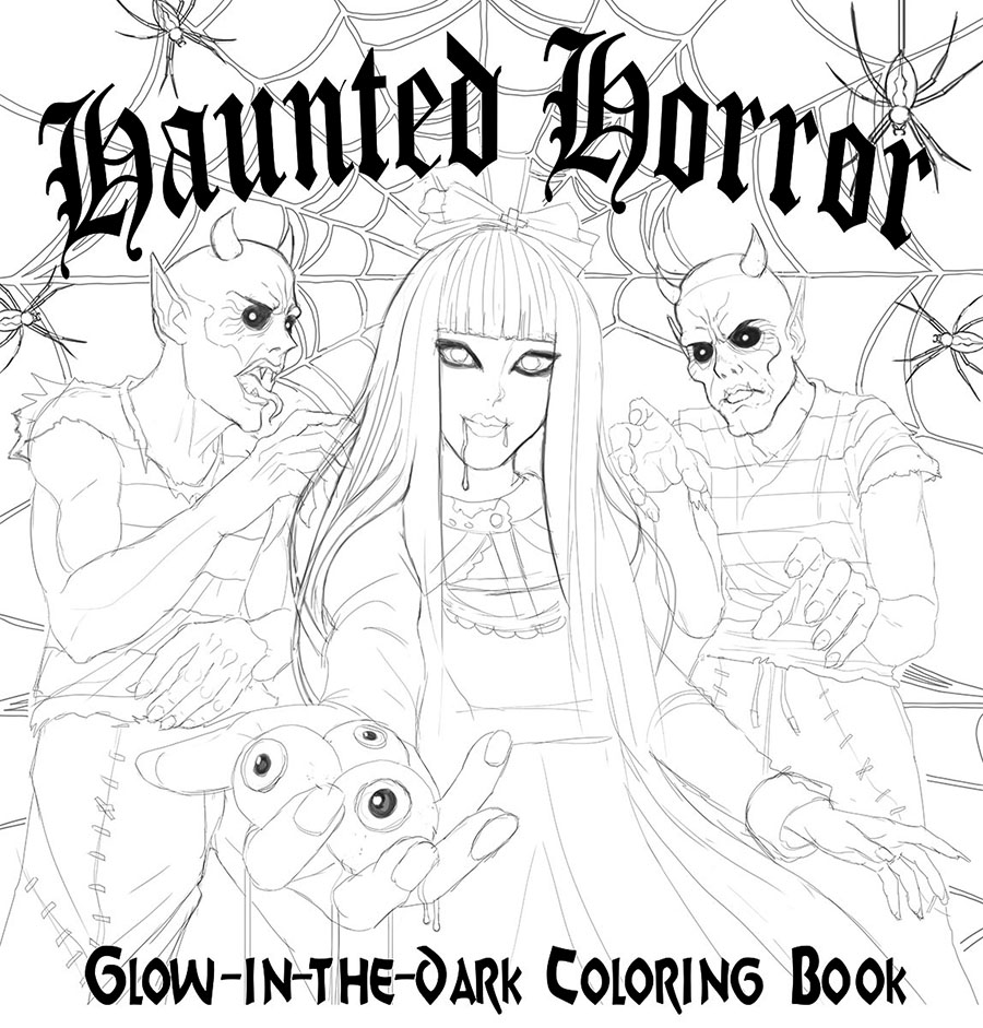
Horror Cover Sketch 1[/caption]


I then amended to the second Hellish Horrors sketch. I like this one even better and makes it clearer that the girl is the one in charge here! Again, client not convinced. I needed to try again with a different idea.

[caption id="attachment_5038" align="aligncenter" width="900"]Horror Cover Sketch 2 Horror Cover Sketch 2[/caption]


I designed the 'Head full of Horror' illustration. I liked the pun for the potential title and thought it would be impactful. It wasn't accepted.

[caption id="attachment_5039" align="aligncenter" width="900"]Horror Cover Sketch 3 
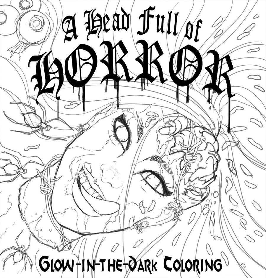
Horror Cover Sketch 3[/caption]


Eventually the corpse/ ghoul bride and skeleton groom below was deemed a little more wholesome. They loved it! I especially liked the 'Eyes-cubes' in the glass.

[caption id="attachment_5036" align="aligncenter" width="900"]Horror Cover Color 
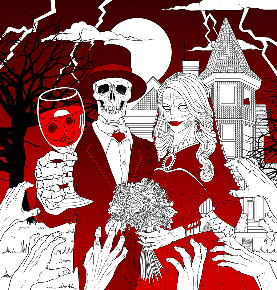
Horror Cover Final with Colour[/caption]


Making use of colouring books

With books like this, I always wonder how much detail is too much detail to include in a drawing? I've seen some colouring books which are effectively fully-rendered, grey-shaded pencil drawings which are presented as colouring pages. I'm not sure I like this idea. What do you think?

Someone choosing to colour a single page from the book might take several hours to finish. With close to 100 pages in a single book, it becomes a project which could take several months. With so many pages one could potentially colour, it seems to be the case that a colourist will more typically choose to work on just a few pages from each colouring book they buy. In the end I guess it's best to have a variety. Lots of details on some pages and not so much on others. If you like colouring books, let me know in the comments below what kinds of themes and styles you like colouring best.


Unicorns & Mystical Creatures was available to purchase via this site's Shop [Edit: I've now sold out! Sorry]. For Americans- you might find it available on Amazon, Wall Mart and Barnes and Noble. The Project / Case Study about this book can be found in my Portfolio here. If you'd like to share your coloured pages from the book, send me a message or link to your social media. I'd love to check them out 🙂

Unicorns Manga Coloring Book

Leave a Reply

Creating Anime Gamer Girl Artwork

by Ben June 25, 2021 in Art 0 comments tags: art, prints, wip

get a life girl1


It was about time I created some new artwork. This time, an anime style school girl; A design I thought might work well as on a T-shirt or Art print with appeal to fans of Japanese anime and video games. I needed an object or symbol floating between her hands in the middle to denote a video game theme. A '1-up' mushroom (an in-game asset granting 1 extra life as originally seen in the Super Mario games) was added. The piece then gained the title 'Get a Life'! To start with, here's some progress images explaining the process.


Digital Sketching

getalife sketch

The digital sketch was created to begin with. As with other recent works, I'd use multiple colours to separate out different parts of the image. This makes its easier for me to read should the line work start getting too messy and complicated. I also sketch the clothing and hair on different layers in Photoshop just in case I decided I wanted to change the hair style or outfit to something else, but still didn't want to lose the pose information. Then the outlines were digitally inked with a thin brush. The original canvas is big- About 12,000 pixel height. this means the image should like sharp even if printed out huge.


Adding Colour

getalife colour

Next I added the flat tones, followed by the first layer of shadows. For a higher quality 'cel' style (using flat tones) I'll usually add at least 2 tones of shading for added depth. Sometimes I'll add another layer of highlights as per the hair in the second coloured image. As mentioned earlier, the 1UP mushroom was added in and some Kanji added to the background. Time-wise I think it took around 20 hours to complete. 15-40 hours for a single character illustration is pretty typical for me.


Now available to buy

[gallery link="none" size="medium" type="square" ids="4963,4964,4965"]


If you like the artwork and would like to support my artistic endeavours, I've turned it into an A3 print, available to buy on my store. It'll be hand signed and shipped internationally. Alternatively, the design is available on a T-Shirt in either Men's or Women's fit. All shirts are currently on sale in the site's shop at a reduced price. Thanks for checking it out :)

Leave a Reply

Creating Monster Art

by Ben February 04, 2021 in Art 0 comments tags: art, creature, monster, sketch

sketchbook monster


Draw and Chill

Growing up as a kid I'd always be creating my own monsters, mutants and robot characters. Now, as an adult, whenever I have a few free hours to draw something, I often turn to my 'Monsters and Mutants' sketchbook to see what I can come up with. The aim isn't to create anything glossy and polished like a lot of my typical digital work. Instead, it's just about having fun and seeing what ends up on the page.


Creation Process

Most of the time I'll just start drawing random shapes and a creature seems to emerge from the page. Occasionally I'll have an idea to begin with. It might be to re-work one of my childhood drawings, or I'll use something from a film, or game as a starting point.


No-Pressure Drawing

To be honest, I never intended to share any of these. Whenever there's an intention to show off my work it creates an added pressure to try harder or even be more self critical. That's not the point of this sketch book. It's all about drawing to relax and have fun with it. If you're an artist or creator, perhaps it's worth also considering the idea that just because you made a thing, it doesn't have to get posted online. It's quite freeing. But if you decide at a later date to share what you do with the world, there's no harm in that either.


Pen and Ink

For some reason I decided to stick with black and white pen drawings for these. Each image starts off as a pencil sketch. I use my trusty Pentel mechanical pencil with a 2B lead. After I've got the basic gist down, I take over with a Zig Manga Ka Flexible pen. I use Fine for the lines and Medium for larger areas of black. Occasionally I'll use black Kuretake Fudegokochi Brush Pen. Although the Fudegokochi pens have a nice flow of ink, sometimes they can over-flow and spill out a bit too much. I've quit using them as I don't want to wait for ink to be drying. I've recently bought a set of white Gel pens, which I expected to use on these, but not had too much opportunity soo far.

These are all drawn in an A5 Molskine sketchbook:


[gallery size="medium" columns="2" ids="4823,4821,4824,4822,4857,4856,4855,4854,4853,4852,4851,4850,4849,4848,4847,4846,4845,4844,4843,4842,4841,4840,4839,4838,4837,4836,4835,4834,4833,4832,4831,4830,4829,4828,4827,4826,4825,4820,4819,4873,4864,4872,4863,4865,4866,4867,4868,4869,4870,4871,4862,4861,4860,4859,4858,4818"]

More creatures to come...

I'm just over two thirds through my sketchbook so far. I intend on finishing it, even if it takes another year or two! If you're interested in commission me to draw you a creature of your own like the above, let me know. Otherwise, I'll continue to rely on what my crazy mind can come up with :)

Leave a Reply

Sugar Skull Girl Frogs and Flowers Art Print

by Ben May 12, 2020 in Art, Thoughts 0 comments


Enhancing Old Art

There's nothing wrong with returning to your older artwork and attempting to improve it, right? Sometimes old artwork just needs a little tweak or a few small changes to make it significantly better or more consistent.

I decided to amend and update my previous frog girl illustration to give it a Sugar Skull twist. I also limited the colour palette with some tonal adjustments. It matches some of the other, recent artwork in my gallery a little better. Plus people have told me they're liking my skull related artwork, so now here's another to add to the collection!

Maybe one day I'll figure out how to match this stuff up with the all the various manga styles I like playing with also? Producing a consistent gallery or range of images is always going to be a challenge when you love producing so many different types of art styles.

SugarskullGirl Print


Decorate your walls

A3 size prints are now available of this one to buy via the site's Shop. I decided to give the option to purchase this new version along with the original no-make-up version plus the marker version I'd create a while back. Do you have a preference?


[gallery type="circle" link="none" ids="4548,3540,4554"]


If you're interested, check of my Traditional Vs Digital: Frog Girl blog post to see some work in progress shots of this one.


New Product Updates in the Shop:

Many of the large / A3 prints in the Shop have now been amended to include Matt, Gloss and a Special Metallic paper finishes. Although the print company I just started using for these is currently closed due to the pandemic lock-down, so frog girl will temporarily remain as Gloss only for the time being. I'll take some photos of the new metallic prints in due course. For now, you'll have to take my word for it but they look fantastic! And managed to put a smile on my face :)

There's something really cool about an physical piece of art be it a print or original. You just can't get it looking at it on a screen. Especially these metallic prints which have light bouncing off them as I move them in my hands.


At the time of posting, prices for most of the A3 prints are:

£11.99 for Matt: Satin smooth paper avoids reflections
£12.99 for Gloss: Deep colours with a sheen
£16.99 for Metallic: Special finish for spectacular effect when in the light

Shipping here in the UK is: £3.40 per print. Europe: £5. USA and rest of the world is: £8.

For a limited time I'm running the promo code 10OFFPRINTS at the checkout stage. It allows 10% off when spending over £30 on art print orders.

Leave a Reply

Creating All Might from My Hero Academia

by Ben April 06, 2020 in Art 0 comments tags: art, wip

all might banner

I'd recently finished binge-watching the first 4 seasons of super-hero anime 'My Hero Academia'. Despite initial reservations after the first episode, I ended up getting into it and really enjoying it. My goal was to create some All Might fan art in a similar style to the Tattooed Goku I'd created a few years back. Here's some work in progress images to show the process:


Who is All Might?


All Might (Toshinori Yagi as he is known in Japan), in the anime and manga series "My Hero Academia," is a symbol of peace and the greatest Pro Hero in the world. His real name is Toshinori Yagi. Possessing immense strength and the ability to transfer his One For All Quirk, a power passed down through generations, All Might has dedicated his life to protecting society from villains. In his hero form, he is an iconic, muscular figure with a distinctive smile that inspires hope. All Might's incredible strength comes with a limitation – a grievous injury that has weakened him over time, making his time as the Symbol of Peace finite.

Beyond his physical prowess, All Might's charismatic and selfless nature has won him the admiration of both heroes and civilians alike. He becomes a mentor to Izuku Midoriya, the protagonist of the series, and plays a crucial role in shaping the young hero's journey. All Might's presence is a beacon of hope and a reminder that, even in a world filled with challenges and villains, true heroes can rise above to bring peace and justice.


Digital Sketching

all might sketches

I started with a digital sketch using reference from bodybuilder Jay Cutler who reminded me of All Might. This was then refined and tidied up, adding his "I am here" catchphrase to the banner- a line he must have used a million times in the My Hero Academia anime!
Time: 7 Hours to draw


Adding Colour

all might colours

The first image on the left is probably around 60% through the colouring process. It was getting a bit dark, so brightened it up and added colourful background splatters to finish. I'm very happy with how it it turned out- makes a nice little tribute piece to the series 🙂
Time: 10.5 Hours to colour – 17.5 hours total.


Own The Art Print

As the icon of virtue, hope and strength, All Might can remind us to do good, help others and be strong. Would you'd like the symbol of justice to hang on your walls? And would rather display art which looks a little prettier than a copy-and-paste screen capture from the My Hero Academia anime? I've turned it into an A3 print, available to buy on my store.


[gallery type="square" columns="2" link="none" size="medium" ids="4387,4390"]


Buy The T-Shirt

I'd thought about creating and offering shirts featuring this and other designs in my store for some time. There was enough interest to make it happen, so have also now added All Might:

[gallery type="square" columns="2" link="none" ids="4683,4702"]

Thanks for supporting my artistic endeavours, and if you're a Hero Academia fan, let me know. See you next time :)

Leave a Reply

Creating Bowsette & Boosette: A Fan Art Project

by Ben December 20, 2019 in Art 0 comments tags: art, wip

bowsette boo

I wanted to create a couple of new fan art pieces for fun. This year I decided to take a crack at Bowsette and Boosette (aka Booette)- a couple of spin-off meme creations from Nintendo’s Mario game series. The goal was to go full-on kawaii manga style with these two- huge eyes and small mouths.


Digital Sketching

bowsette sketch    

I started with a digital sketch. Using multiple colours helps prevent getting confused by too many messy lines all over the place. After Bowsette was finished, I used her as a template for creating Boosette.
Time: 16 Hours


Neat Outlines

bowsette drawing

Then came time to clean up the artwork by digitally inking it. I kept the line work pretty thin for this project and not using thicker, heavier lines for the outside or varying line weighs like I might do in previous images.
Time: 11.5 Hours


Flat tones

bowsette art

The next stage is laying down the flat tones. The process of sketch, ink, flats and then rendering the flats is a technique and workflow I’ve been using in digital artwork since the late 90s. It’s a process that works out great for being able to isolate certain colours and parts of an image, keeping the artwork looking tidy and smooth, while retaining the line art, rather than painting over it.
Time: 1.6 Hours


Colours and Shading

bowsette colors

Then it’s time to choose colours and a light source. This time light is coming from the centre/ top left. I start with a two-tone ‘anime cel’ style to figure out how much shadow the put down. I could leave it at this cel stage by sticking with the flat tones, but I’m often too tempted to start rendering and adding smooth gradations to the tones. As much as I love the typical anime aesthetic, I prefer creating a more 3D, airbrushed and rendered artwork.


Finished Artworks

bowsette boosette color

Lots of rendering time later and both are finished. They make a good pair- by having opposing colour schemes- one with red/orange and the other with purple and blue. The artwork is tight and polished, making it suitable for large scale printing with the original image dimensions each being close to 14,000 pixels high!
Total time: 56 Hours – 28 hours each.


What’s next? I love experimenting in different styles, so I’ll probably take a break from the Kawaii manga look for a while and try something else. But this project showed me if I ever want to create more artwork in this style, I know I can nail it successfully 😊

Leave a Reply

A look back art some of my artwork

by Ben December 22, 2018 in Art 0 comments tags: #animeart, art, artwork

Here's a cropped and grouped collection of some of my digital art. Some bits dating back to as early as 2001 and others I'd done over recent years. Kind of interesting to see the different styles I've played with over the decades and crazy to think how long I've been doing the whole art thing for. It seems pretty common for artists to look at their older artwork with shame and embarrassment, but while I might notice a few flaws and things I'd do little different now, to be honest, I still kinda like a lot of it. 

[gallery columns="1" size="large" ids="3695,3696,3697,3698,3699,3700,3701,3702,3703,3704"]

Leave a Reply

Drawing Ghost in the Shell Art

by Ben November 24, 2018 in Art 0 comments tags: animemanga, art, ghost in the shell, gits, wip, work in progress

Ghost in the shell Banner

A Ghost in the Shell fan

I started working on a new bit of anime fan art a while back and thought it was about time I added some progress shots to my blog. I've been a fan of Shirow's (Creator of the Ghost in the Shell manga) work for 25 years or so. The first anime movie wasn't bad, but they really managed to nail it with the 'Ghost in the Shell: Stand Alone Complex' anime series. Complex is a good word for it as it's not your typical, basic 'good vs evil' plot, but something I'd recommend to older audiences who want a Sci-fi series with a little more depth and intricacy. I loved it! I wanted to pay some homage to the G.I.T.S. Solid State Society series with this artwork.


Sketching

[caption id="attachment_3794" align="alignnone" width="750"]Ghost in the Shell WIP1 
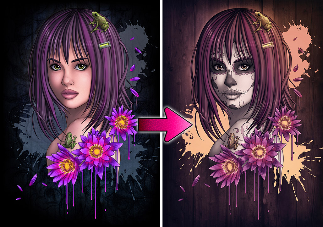
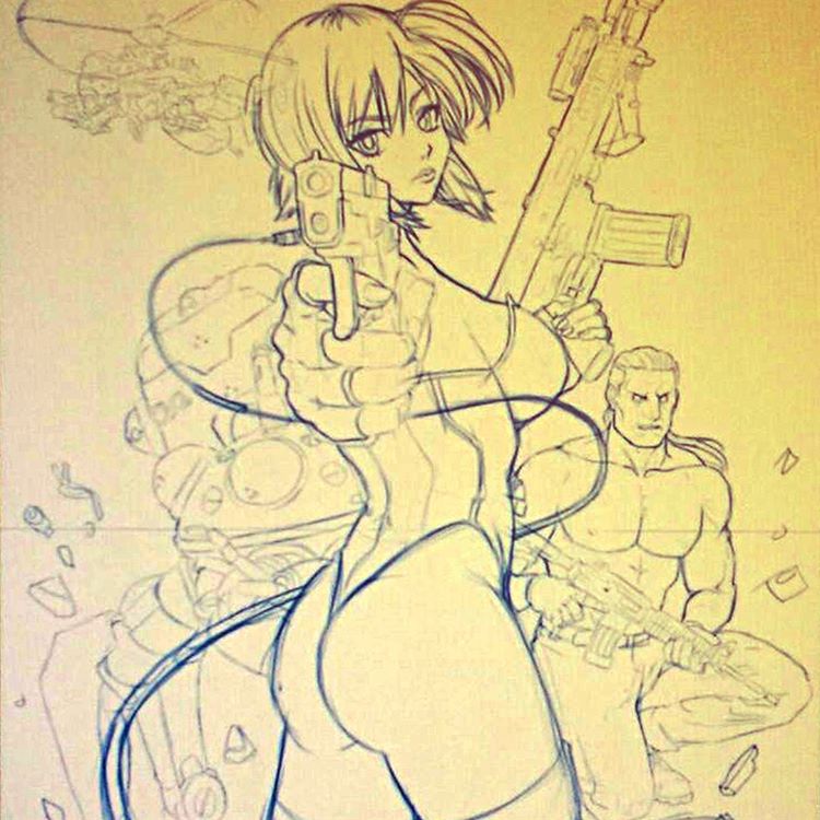
I usually start sketching in blue. This time straight into Photoshop. I want to go detailed with this piece so using a lot of reference to help out. The orange fade is just to stop it looking a bit dull, but I'd work with blue onto a white canvas.[/caption]


[caption id="attachment_3796" align="alignnone" width="750"]Ghost in the Shell WIP2 
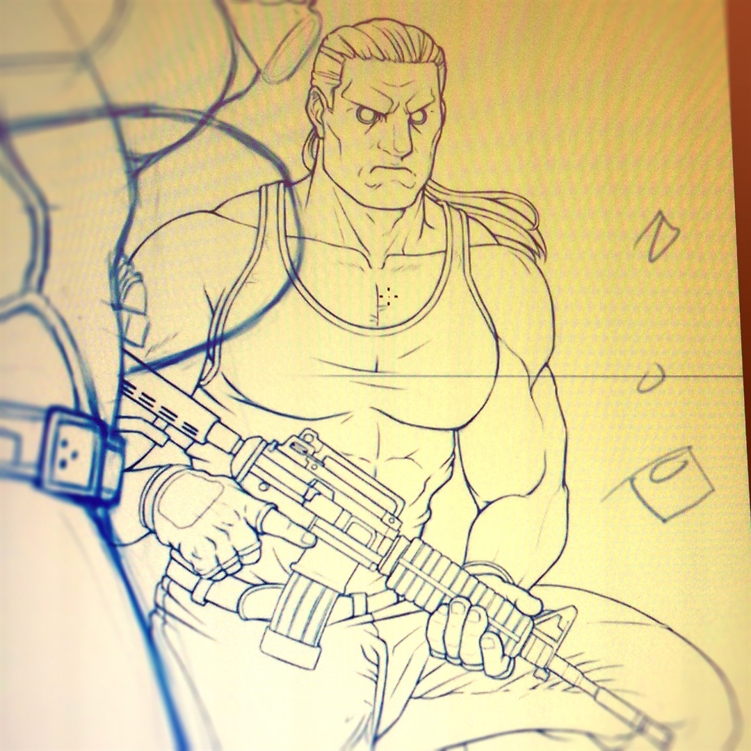
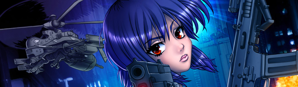
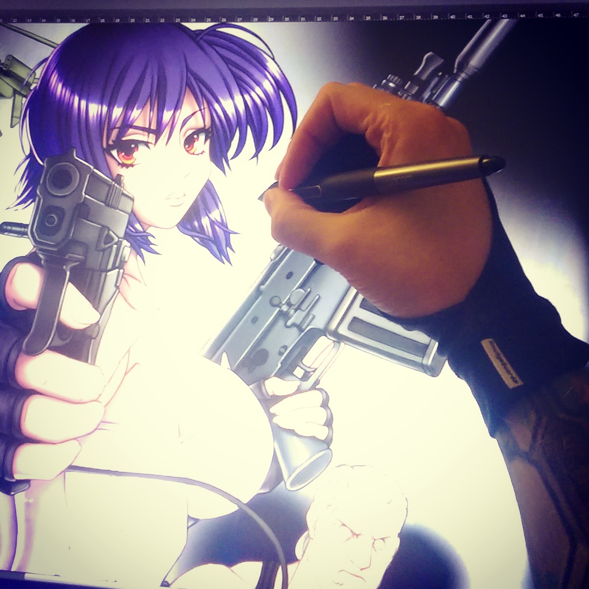
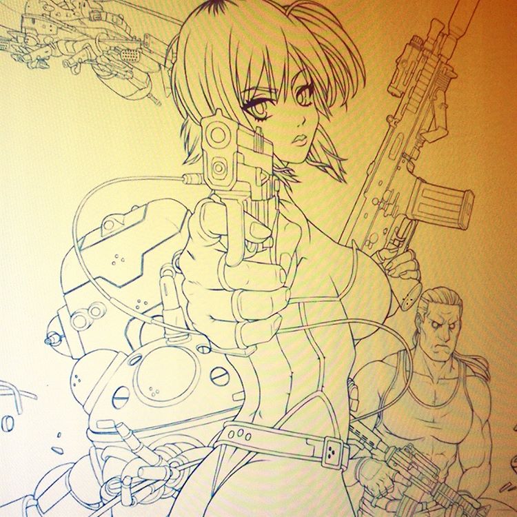
Finished refining the line work for Ghost in the Shell's main character, Major Motoko Kusanagi and Tachicoma robot behind.[/caption]


Colouring

[caption id="attachment_3798" align="alignnone" width="750"]Ghost in the Shell WIP3 Finished laying down the base colours. Some artists might leave it there but I don't like the way art looks before I start rendering and adjusting the colour pallet.[/caption]
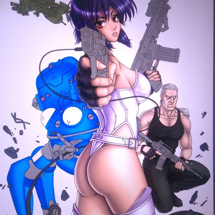
 

Ghost in the Shell WIP4


Ghost in the Shell WIP5


The Finished Artwork

[caption id="attachment_3541" align="alignnone" width="940"]GhostintheShell Print Here is the finished Ghost in the Shell artwork. Took around 3 weeks, but finally done :)[/caption]


Thanks for following through the progress with this one. If you happen to be a Ghost in the Shell fan and would like to support the work I do, feel free to head over to the shop and make a purchase. I currently have this one for sale as a signed A3 sized print. [Now in Metallic!]

If you'd be interested in seeing any more progress blog posts, let me know with a comment. I sometimes also post works in progress first on Instagram and social media, so you can head over there if you're interested in seeing what I'm currently getting up to :)

Leave a Reply

Adding New Art – When to post it online

by Ben March 15, 2018 in Art, Art Talk, Blog 0 comments tags: art, artwork, drawing, phostoshop, robot

Robot Cry

When to update an online gallery?

Sometimes I'll create a sketch or two, other times more finished artworks, but most of the time I don't add these to my main gallery.

I'm trying to reserve the gallery for my top 30 or so works. It's never easy to know exactly which art to include in my portfolio. How can one judge when a work's quality or relevance trumps another? I've attempted to curate my portfolio as best I can based on personal feelings, but it might be an idea to get an outsider opinion on these things also?

For now I use this Blog to update with other bits and pieces I'm working on. Even on the blog, it can be tricky to know if something is worth posting. I draw little doodles and crappy sketches often, but don't necessarily want to post every little thing I do. Plus I don't want to feel I'm contributing the internet's archive of never-ending, pointless content!

For some reason I think about this a lot! There's so much stuff on the web, so what is actually worth posting online?


To build an audience I'm supposed to post regularly, non-stop

For many companies, organisations and individual artists the idea is to post often to help build an audience. As with brand recognition, you post regularly; supplying a stream of content in order to become a fixture in the the lives of your online followers. It takes time for people get to know what you're about. But, eventually, you build some kind of online relationship, gain a following, receive kudos and potentially generate income.

For independent creators it can be difficult to post regularly by creating enough finished content worth sharing. Attempting to facilitate this necessity can become stressful.

So on the one hand I feel like I should throw up some rough sketches or incomplete drawings, since posting something is considered better than nothing. On the other hand, I don't want to litter the web or my sites with valueless (in my opinion) posts just for the sake of posting. Plus, to be honest, I don't like the pressure of feeling like I have to keep posting updates online.


I wish blogs didn't go out of fashion!

I'd be happy to post more on my site's blog (here) since I have a chance to go into as little or as much detail about what I'm doing or thinking as possible. However 99% of my audiences are mostly on social media - primarily Instagram. Despite having tens of thousands of followers, Instagram's format isn't really suitable for more than a square image post and a line or two of description. I don't like it.

One thing I do know is, unless this blog was to get more attention, it's hard to justify spending too much time posting here as often as I'd otherwise like. Therefore, for now, I don't.


Crying Robot Tears

While I don't intend on Blogging every other day, and while I have decided I don't want to post absolutely every sketch or mark I leave on a sheet of paper, I did want to share this a piece I'd been wanting to rework for a few years:

The Photoshop screen shot above shows the original concept on the left, and the update on the right. I had this idea to create a narrative scene showing the sad robot guy cradling his dead owner/lover/?, while facing a gun to his head. What lead to this event I wonder? What will happen next?


One for the Blog

It's a little sketchy and unrefined but I think I'll leave it as it is for now. Not all ideas or art needs to be polished to perfection. For those works, they can live here in this blog.

Leave a Reply

Art Dump 3: Old Stuff

by Ben March 04, 2018 in Art, Instagram 0 comments tags: #animeart, #mangaart, #oldart

Here's another selection of some of my older manga, game or anime inspired artworks (originally posted on my Instagram and cropped). Let me know if you have a favourite out of these :)

Check out Art Dump #1 and Art Dump #2 for more.

[gallery type="rectangular" size="medium" link="file" ids="3509,3510,3511,3512,3513,3516,3515,3514,3517"]

Leave a Reply

Sign up to Newsletter
For art-related news, updates, a 15% discount on all art print orders PLUS be entered into a free bi-monthly prize-draw to win a mini art print!

This field is required.

Many thanks for subscribing!


FEATURED PRODUCTS
  • Medusa Sticker
    Medusa - 4 inch Vinyl Sticker
    £4.00
  • Anime Bowsette
    Bowsette Art Print - A3
    £17.99 – £27.99Price range: £17.99 through £27.99
  • Sale Product on sale
    Dio and the World - Men's
    T-SHIRT Dio and the World - Short Sleeve Tee
    £24.99 Original price was: £24.99.£19.99Current price is: £19.99.
  • Sale Product on sale
    Mens Junko Danganronpa Tshirt
    T-SHIRT Danganronpa - Short Sleeve Tee
    £24.99 Original price was: £24.99.£19.99Current price is: £19.99.
  • Japanese Geisha Wall Art Canvas
    Japanese Geisha Wall Art Canvas
    £24.99 – £599.99Price range: £24.99 through £599.99
  • World War Skull Art
    World War Skull Wall Art Canvas
    £24.99 – £599.99Price range: £24.99 through £599.99


BLOG ARCHIVES

RSS Feed RSS – Posts

RSS Feed RSS – Comments


Return to blog start...